Showing posts with label Book Reviews. Show all posts

October 25, 2015

A Review about Painting Water

Painting All Aspects of Water for all Mediums by: E. John Robinson  (available at the Sandy Library)

I’ve only just begun to read the first chapter in this book and I have already fallen in love with the author.  He’s very knowledgeable in the characteristics of water and how it behaves.  I will share with you a few things I have learned about water that I can relate to even though I never studied the qualities of water.

1.      Water is always level on the ground.  It can be diagonal, or vertical in appearance if it is a waterfall or rain runoff.
2.      Water changes it’s physical shape to fit into certain spaces.
3.      Water is a reflecting agent much like a mirror or sheet of glass
4.      Water is often transparent and it can move with gravity
5.      Shallow water of a lake is more transparent than deeper waters of an ocean
6.      The surface of the water reflects a path of light that:  ALWAYS comes towards the viewer.  If it goes off in another direction, it leads the viewer’s eye right out of the painting.
7.      It reflects the colors above and below it depending on how shallow it is
8.      A mirror image reflection:
a.       Carries the colors, values and shapes of the objects it is reflecting
b.      If the object, such as a rock, is slanted, the reflection can be refracted into a different direction
c.       The size of the object equals the reflection on the water, however, you do not measure the objects reflection from the bank of a river, but from the base of the object itself, towards the water.  i.e. a tree measures from the base to the top=3”, the reflection will measure 3” from the base of the object down into the water.  Which basically means; you may only see 1” of the objects reflection.  The other 2” maybe a shadow or nothing at all.
d.      The reflection should be an exact duplicate of the object if the water is completely smooth
9.      A slanted object, such as the hull of a ship, reflects in the opposite direction, but moves towards the viewer.  The water “sees” more of the hull than the viewer, so the reflection will be extended and have more details than what the viewer sees from above.
10.  Rippling water distorts the reflection but is measured exactly the same as “C” above.  However, the refection will be quite different in appearance.  Edges of the reflections become wavy and darker values can begin to mingle with lighter ones.  Strong ripples introduce only the sky and background colors, very little, if any detail.
11.  Extended Reflections or bouncing, choppy water reflections caused by waves in the water, will bounce the reflection on top of the water, but introduce darker sky colors between the waves.  Here the darker values and lighter values can completely reverse or be together creating more interest.
12.  Choppy waters may be in isolated locations or over the entire painting creating lost and found edges which allow the sky color or colors from below the water to mingle, depending on the depth of the water.
13.  The color of an object is nearly identical to the reflection if the water is smooth.  Choppy water can distort the colors quite a bit.  i.e. white becomes a faded, soft yellow in appearance. 
14.  Scattered light dancing over the water creates interest, but a glare is when a wave reflects intense light directly into the viewer’s eye.  It is a concentration of light, not sparkles dancing.  i.e. larger white areas versus a splattered effect.  Reserve white areas to suggest the movement of water in shallower waters.  Especially around rocks, where the water moves in and out and around the base of the rocks.
15.  Water holds the reflected shadows of an object, directly below the object such as boulders and fallen tree trunks.  

Most of this information we already know from experience, but when listed like this, it refreshes our memories.  Hope these notes help you with your painting water in the future.  I will add more notes as I continue reading this wonderful book.  

July 14, 2015

August 2015 Issue

I look forward to getting this magazine from the book store because every issue is packed with good articles about an interesting technique or an introduction to another artist's methods or insight.  It never fails to give me hours of pleasant reading and leisurely thoughts about experimentation with various mediums.

This issue has an article that definitely has me thinking about possibilities: "Face Time".  Myrna Wacknov explores mixed media-and her own features- in a series of powerful self-portraits.  I've been gathering up some selfies to work with over the past couple of months and even if you don't incorporate mixed media, this project would be fun to do in watercolor or inks.

Other articles include "Burned Tree Bark" by Suze Woolf.  I found the photos and her process to be very interesting.  I would probably never venture into a burned out forest to retrieve burnt bark, but the textures are amazing.

There are a few more articles I need to get back to reading, "Studio Staples" Discover 6 paint mediums that can add impact to your work by Jessica Canterbury  and "Watercolor Essentials" Learn how 7 artists employ the elements of design by Beth Williams.  

July 8, 2015

Light & Shadow- A Book Review

Did you know that the Sandy Watercolor Guild has a library? We have several dozen books available for you to check out. Karla would be the person to see about having access to the books and this book shown on the right is one of them.  I checked this out last week and while I'm not quite finished reading it, I thought I would share some information about it with you.

It is all about what the title says: Light and Shadow.  Yup-that's easy right?  Not as easy as it sounds in reality.  There are different types of light which effects the whole image. Light can make a black roof appear to be white and a white house appear to be black! Sounds crazy but it's true and we can express this drama by the way we paint and the color palette we decide to use.

If you work from photographs, as I do, you will appreciate the method William Lawrence uses.  Breaking down the image into just 2 shapes.  One shape would be the light and the 2nd shape being the shadows.  Simple?  It is if you eliminate all the fussy details at first.  Not every photo would work with this method as easily as others.  Finding a photo that is on the simplistic side would certainly help, but even those images with lots of objects can be used.  Solution would be to simply turn the photo upside down, not view them as objects you know, but only as shapes.  Changing the image to black and white, or grayscale, even better!

"It is where edges are lost that shapes are locked into a painting."  William Lawrence

Hope this gives you inspiration to check out our Guild's library!  Or your local library, which also has some fabulous books on watercolor.  Reading books on oils and acrylics can also inspire you, as all the wet media techniques can be used together or separately.  Try acrylic techniques with watercolor if you enjoy experimenting.  You never know what will happen unless you try.  Cindy

April 2, 2014

April Challenge

Last month the challenge was to make some image transfers from magazines and I'll bet you have a bunch of these now, but what will you do with them?  Here's an idea:  Combining Ev Hales suggestion of using splashes of color as backgrounds, you can simply adhere your tape transfer directly over the color splashes using glue that will dry clear, deco podge, or a gel medium.


 Here are a couple of samples that I made:

 If you would like to take this process even further, coat the entire image transfer with the clear drying gel medium, glue or deco podge and let dry.  This becomes a permanent acrylic surface that can be further painted on using acrylics or gouche.  If you want to hide the straight edges, you also can cut the tape to remove most of the edges.  For instance, I would cut out the bird and the branch it is sitting on.  The background would then become the color splash.  Experiment and see what you like best. 

As for Ev Hales book, it is one of many creative, art books that she has written about watercolor.  A great addition to any library.  I prefer the Kindle edition, but you can order a soft paper style book direct from Amazon, by clicking the book cover in the right sidebar.
 

December 31, 2013

Book Review by: Cindy Powell

I recently read Linda Kemp's newest book shown here and while it was geared to negative painting techniques, it also had a lot of other interesting topics, such as: color theory, composition, design elements & principles, and making color choices based on value, hue or intensity.  Linda explores these and many other concepts in depth and provides some beautiful paintings along with exercises/challenges for you to do.  For beginner/intermediate artists who want to further explore the opportunities that watercolor painting offers. 
Tip: "Convert a color wheel into a gray scale wheel and you will clearly see where all the true colors lay on a gray value scale."  Great tip!!

"Whether you work with positive or negative shapes, the size & shape of the subject is established at its edges...." Linda Kemp  She is explaining how the edges are important in your painting, whether they are soft or hard, lost or found, they determine what the viewer sees.   

New Sidebar Inserts

In the sidebar, to the right, you may have noticed that there are book covers shown.  If you click on one of these images, you will be taken directly to the Amazon website where you can purchase the books, either in a printed format or a Kindle (virtual) format. 
You might also like to check out your local library for these books to preview them first, to see if you would like to add them to your own private library.  I will be adding more inserts as I finish reviewing each book. 
I usually buy books for my virtual library now, so I may not always have a photo of a cover to share with you when I write my review, but using these sidebar inserts, you will be able to go to Amazon to see the cover and preview the book on-line. 

December 22, 2013

Watercolor Wisdom-Book Review by Cindy Powell


“Watercolor Wisdom” by: Jo Taylor AWS

I found this book in my local Sandy library but I am currently looking for this book to add it to my private reference library.  It’s a must have!  Here is a sampling of what you can find in its pages of wonderful information:
Mixing warm and cool blacks!  Oh yeah-how many of us know how to mix black?  We all do, but do we know which colors to mix for a warm black and which for a cool?  We are often told not to mix our pigments in a 50-50 ratio, but Jo Taylor recommends it when mixing a warm black. 

Which pigments should we use to create harmony in our paintings?
Which color(s) should dominate?
How do you approach an abstract to create balance and unification in the composition?
What tools can be used to create wonderful textural effects in watercolor?  (Besides the ones we all know about).
What resists can be used with water media/watercolor?
How can you stamp an image with watercolor pigment and make it adhere to the paper?
What composition should you use?  Can you combine them?  (Yes!)
What does “Gradation of Color” mean?
How can you use a palette knife to create a wonderful quick painting?  (See our Jan. Challenge!)
How do you “Monoprint” using watercolor pigments?
When planning a painting what options should you consider for the best visual effects for your viewers?  What are the principles that can be used?  What should be the emphasis-vertical or horizontal layout? 

These questions and a whole lot more are answered in this one unique book along with several fun experiments for you to try. 
I will simply say again, this is a must have book for any artist who wishes to incorporate or experiment with mixed media/watercolor. 

“In the test of time, a piece of art must stand on its own.  The artist is not present to explain, radiate enthusiasm or identify the subject.”  Jo Taylor

December 3, 2013

Welcome

We are in the process of setting up this blog so that the members of the Sandy Watercolor Guild will have a place to share their paintings, tips, ideas, etc. with the general public and each other.  If you live in the Sandy, Utah area, we would like to extend an invitation to you, to join us every 3rd Thursday of the month at the Sandy Senior Center, from 6:30-8:30 for our regular monthly meetings.
As the members of the Sandy Watercolor Guild become more familiar with how this blog works, we will be posting more frequently, so you may want to sign up to follow this blog, via your e-mail.  The link is in the right sidebar.  (Simply type in your e-mail address and click the button. You will be sent an e-mail each time a post is made to this blog).
The list of topics that has been generated in the right sidebar is just a set up action at this time.  There are no posts available for these subjects yet.  With time we hope to bring you a wide variety of topics related to watercolor painting and other water media.   We will be adding additional pages, just like on a real website. These additional pages will be listed in the sidebar soon and will have a heading related to what is posted on that page. ( i.e. a demonstration of a painting being created, a video feed or a tutorial for a particular technique).
Each member will be given the opportunity to be added as an author to this blog and will have access to post their own images and write their own articles for the group to read.  Posting of upcoming events, information about workshops, etc. is fine.
A few words of caution when using this blog:   Please do not post any personal information to this site, as it is seen by the general "world" public.  Do not post that you are leaving for a vacation, or that you have a new phone number.  Keep that information private and share with your friends, face to face.  If you do not want your photos to be used by others, resizing them to a 500 pixel x 500 pixel format at a 96 resolution will allow for better viewing without adding a watermark.  Visitors can click on the image posted for a larger version, but without all the high resolution for printing purposes.  You may add a watermark if you desire, at least sign your work before posting a photo of it, so that we all know it is yours.  As you load your images to this blog, blogger will give you options for size and placement.  I won't go into that right now, but will be adding a video for members only to view on my youtube channel that will show you step by step how to add images and post new information.  It's relatively easy to do.
When we are up and posting begins, please leave us a brief statement about what you are posting.
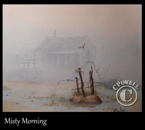
The painting I shared here was done in my daily painting journal and my goal was to paint an image surrounded by fog.  I was following step by step instructions provided in "Keys to Painting Color & Value" by: Rachel Rubin Wolf, a book I picked up at the local library.